Indicators
Accumulated Trades (AT)
| Description |
|---|
| The Accumulated Trades (AT) indicator helps identify the level of interest in a financial instrument over a specific time frame. It calculates the total number of trades accumulated during a specified period (e.g., 4 hours, 1 hour, 15 minutes, or 1 minute). This indicator is particularly valuable for filtering instruments in swing trading, day trading, and scalping strategies. By plotting the AT indicator on a chart, traders can visualize the trade volume at specific intervals and observe how it correlates with other relevant parameters. Analyzing this data can be instrumental in refining trading strategies. |
| Chart | Watchlist |
|---|---|
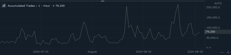 |
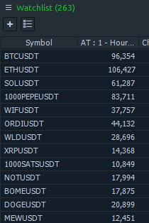 |
Average True Range (ATR)
| Description |
|---|
| The Average True Range (ATR) is a technical analysis indicator that measures market volatility. The ATR is typically calculated using a 14-day period, but this can be adjusted based on the trader’s preference. The ATR indicator helps traders understand the average range of price movements over a given period, indicating market volatility. High ATR values indicate high market volatility, while low ATR values suggest a period of consolidation or low market volatility. |
| How it works |
|---|
| The Average True Range (ATR) indicator measures market volatility by considering the average range of price movements over a specified period. TR doesn’t indicate price direction; instead, it reflects the degree of price volatility. |
| Chart | Watchlist |
|---|---|
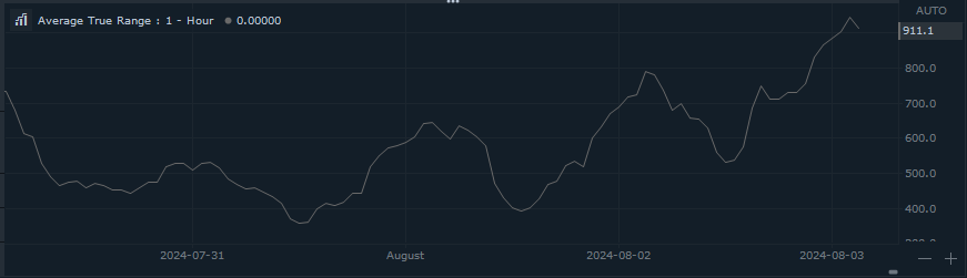 |
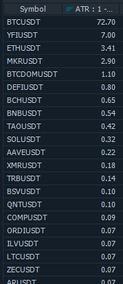 |
Candle Patterns (CP)
| Description |
|---|
| The Candlestick Pattern (CP) indicator is a powerful tool in technical analysis. It helps traders identify common candlestick patterns and interpret price movements. Different candlestick shapes (such as doji, hammer, or engulfing) convey information about market sentiment. |
| How it works |
|---|
| The Candlestick indicator visually highlights various candle patterns directly on the chart, making it easier for traders to identify and interpret these patterns. By recognizing specific formations (such as doji, engulfing, or hammer), traders can make informed decisions based on historical price behavior. |
| Chart |
|---|
CandleStick Volatility (CV)
| Description |
|---|
| Candlestick charts provide valuable insights into price movements, and the size of individual candlesticks plays a crucial role in assessing market volatility. By analyzing candlestick sizes, traders can gauge the intensity of price fluctuations. Additionally, the indicator displays each candle’s size as a percentage, allowing for easy comparison with other candles. |
| How it works |
|---|
| The volatility for each candle is measured as the difference between the high and low prices. The resulting value is expressed as a percentage. |
| Chart |
|---|
 |
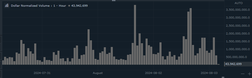
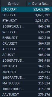
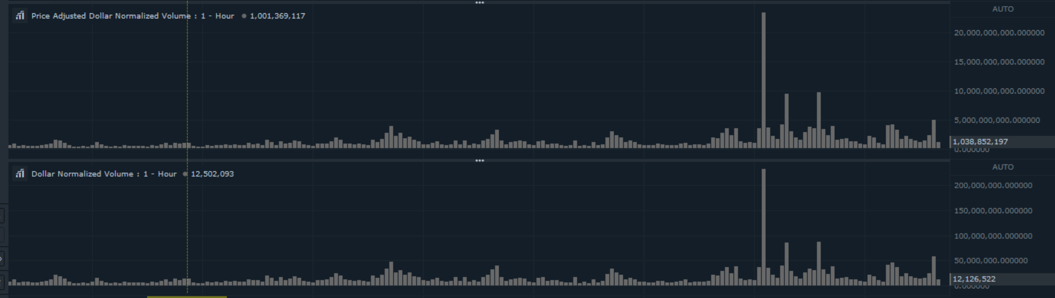
Dollar Normalized Volume (DNV)
| Description |
|---|
| The Dollar Normalized Volume (DNV) indicator is a trading tool that quantifies transaction volume in dollar terms, rather than simply counting the number of shares or contracts traded. By considering the actual monetary value exchanged, the DNV provides a clearer insight into the flow of money in and out of a security. |
| How it works |
|---|
| The DMV indicator is calculated by multiplying the average price of the security by the volume traded. The indicator helps traders identify significant changes in trading activity by showing the volume in dollar terms. |
| Chart | Watchlist |
|---|---|
 |
 |
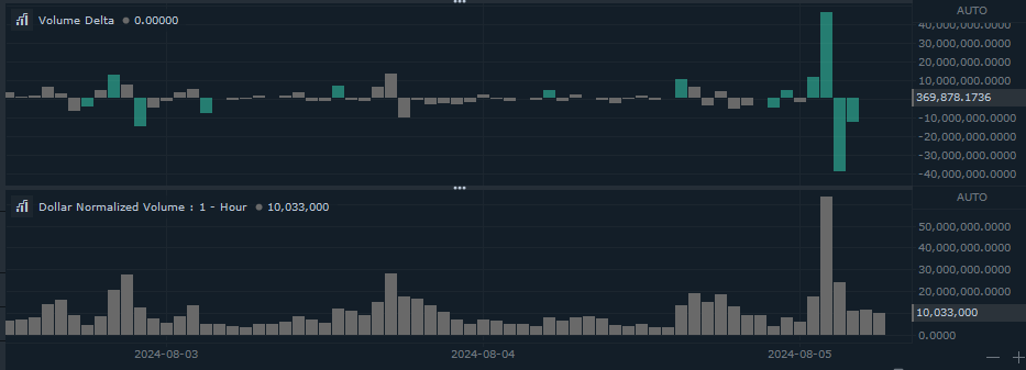
Volume Delta (VD)
| Description |
|---|
| The Volume Delta indicator provides insights into the volume difference between the current and previous volume bars. |
| How it works |
|---|
| It calculates this difference by subtracting the volume at the current bar (denoted as volume[n]) from the volume at the previous bar (denoted as volume[n-1]). Essentially, it quantifies the change in trading volume over consecutive bars. |
| Chart |
|---|
 |
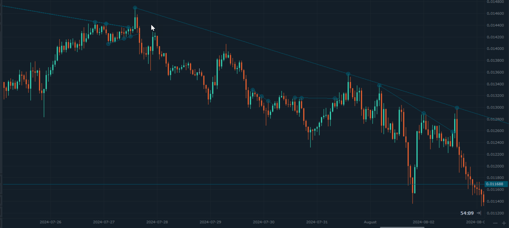
Trend Lines (TL)
| Description |
|---|
| The Trend Line Indicator assists in automatically drawing trend lines on a chart. It considers parameters such as proximity and the number of times the trend line touches price points. By doing so, it simplifies the process of identifying and visualizing trend directions. |
| How it works |
|---|
| This indicator is very useful when testing strategies based on trend lines and removes bias. |
| Chart |
|---|
 |
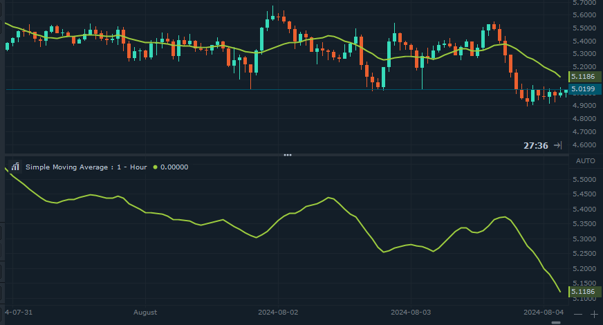
Simple Moving Average (SMA)
| Description |
|---|
| The Simple Moving Average (SMA) is a technical indicator used in financial analysis. It calculates the average price of an asset (usually based on closing prices) over a specified period of time. SMA smooths out price volatility, making it easier to identify trends. It helps traders and investors assess whether an asset is in an uptrend or downtrend. |
| How it works |
|---|
| To compute the SMA, add up the closing prices for a given number of time periods (e.g., days) and then divide this total by the same number of periods. |
| The formula is: SMA = (A1 + A2 + … + An)/n Calculating the SMA for 15 days: [20 + 22 + 24 + 25 + 23 + 26 + 28 + 26 + 29 + 27 + 28 + 30 + 27 + 29 + 28 = 392], [392/15=26.13] |
| Chart | Watchlist |
|---|---|
 |
 |
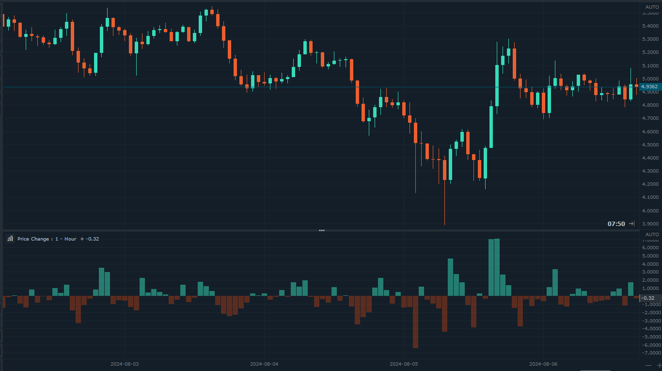
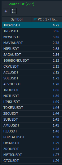
Price Change (PC)
| Description |
|---|
| The Price Change (PC) indicator visualizes the median price increase as a percentage. |
| How it works |
|---|
| The Price Change (PC) indicator calculates the median price of the current candle and compares it to the previous candle. The resulting price change is then displayed as a percentage. |
| Chart | Watchlist |
|---|---|
 |
 |
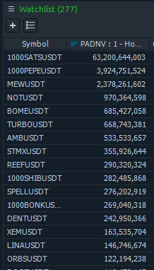
Price Adjusted Dollar Normalized Volume (PADNV)
| Description |
|---|
| Price Adjusted Dollar Normalized Volume (PADNV) indicator similar to Dollar Normalized Volume except it is normalized that allows to make it compatible across different securities and price levels. |
| How it works |
|---|
| Normalization ensures that the indicator remains compatible across different securities and price levels. The result is represented in percent. |
| Chart | Watchlist |
|---|---|
 |
 |
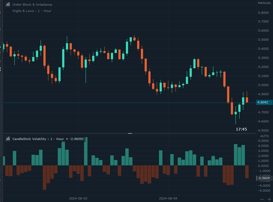
Order-Block & Imbalance (OBI)
| Description |
|---|
| Order blocks, also known as order zones or levels, represent significant price areas where numerous market participants simultaneously placed buy or sell orders. These zones can act as support or resistance and serve as key entry and exit points for trades. Imbalance help locate areas on price charts where significant supply and demand imbalances occur. |
| How it works |
|---|
| Order blocks are often identified through price action analysis, marked by sudden shifts in market direction or momentum. Imbalance help locate areas on price charts where significant supply and demand imbalances occur. |
| Chart |
|---|
 |
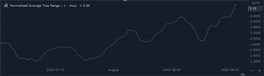
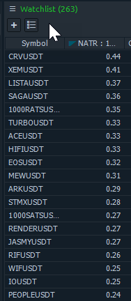
Normalized Average True Range (NATR)
| Description |
|---|
| The Normalized Average True Range (NATR) is a volatility indicator that adjusts the Average True Range (ATR) to make it comparable across different securities and price levels. This is achieved by expressing the ATR as a percentage of the closing price. |
| How it works |
|---|
| By normalizing ATR, you can compare volatility across different stocks or securities, regardless of their price levels. It provides a clearer picture of volatility by removing the bias introduced by absolute price values. We need to calculate ATR as usual and then we divide by the closing price. It helps in identifying stocks with the desired volatility for your trading strategy. Volatility Analysis: Useful for understanding market conditions and making informed trading decisions. |
| Chart | Watchlist |
|---|---|
 |
 |
Large Trades (LT)
| Description |
|---|
| XXXXXXXXXX |
| How it works |
|---|
| XXXXXXXXXX |
| Chart | Watchlist |
|---|---|
| XXXXXXXXXX | XXXXXXXXXX |
Impulse Correction (IC)
| Description |
|---|
| Impulse-Correction indicator helps traders identify impulses and corrections (valid pullbacks) on price charts. Impulse moves are strong, directional price movements that cover a significant distance in a short period. They indicate a powerful imbalance between buyers and sellers, often driven by institutional players. Correction or pullbacks are temporary retracements within larger trends. They occur when price temporarily moves against the prevailing trend. Impulse moves provide profit potential, while pullbacks allow traders to capitalize on favorable entry points. |
| How it works |
|---|
| Impulse moves are strong, directional price movements that indicate a powerful imbalance between buyers and sellers. |
| Chart |
|---|
 |
Historical Trades (HT)
| Description |
|---|
| Highs and Lows TF indicator defines the lowest and highest prices for a given instrument with time-frame agnostic. It’s a valuable tool for traders, automatically marking these critical price levels with lines on a chart of a different time-frame. The indicator is based on impulse correction indicator. It takes highest and lowest points with option to select custom time-frame that is different from the chart. This allows as an example to see highs and lows of a daily time-frame on a minute chart. |
| How it works |
|---|
| The High-Low TF indicator plots horizontal lines representing the highest and lowest prices over custom time-frame that is not connected to the chart’s time-frame. These lines act as support and resistance levels, helping traders identify potential entry and exit points. |
| Chart | |
|---|---|
Highs & Lows (HL)
| Description |
|---|
| High-Low indicator defines the lowest and highest prices within a specific timeframe. It’s a valuable tool for traders, automatically marking these critical points on a chart. The indicator is based on impulse correction indicator. It takes highest and lowest points. |
| How it works |
|---|
| The High-Low indicator plots horizontal lines representing the highest and lowest prices over a given period. These lines act as support and resistance levels, helping traders identify potential entry and exit points. When the indicator is positive and rising, it signals a bullish trend. Conversely, if it’s negative and falling, it indicates a bearish trend. |
| Chart |
|---|
 |
Exponential Normalized Average True Range (ENATR)
| Description |
|---|
| The Exponential Normalized Average True Range (ENATR) is a volatility indicator similar to the Normalized Average True Range (NATR). However, ENATR calculates the Average True Range (ATR) based on the Exponential Moving Average (EMA) instead of the Simple Moving Average (SMA) used by NATR. The key advantage of ENATR is its quicker responsiveness compared to NATR. |
| How it works |
|---|
| By normalizing ATR, you can compare volatility across different stocks or securities, regardless of their price levels. It provides a clearer picture of volatility by removing the bias introduced by absolute price values. It helps in identifying stocks with the desired volatility for your trading strategy. |
| Chart | Watchlist |
|---|---|
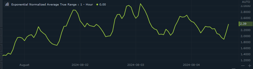 |
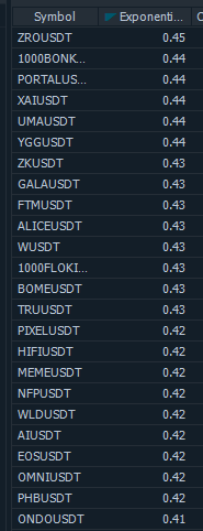 |
Exponential Moving Average (EMA)
| Description |
|---|
| The Exponential Moving Average (EMA) is a weighted moving average used in trading to measure trends in financial securities. Unlike the Simple Moving Average (SMA), which assigns equal weight to all price data points, the EMA gives more weight to recent data. The EMA reacts more quickly to price changes than the SMA, making it ideal for volatile markets. It helps predict future price direction by emphasizing recent data. |
| How it works |
|---|
| First, we compute the SMA for a given number of time periods (e.g., 10 days). The SMA is the sum of closing prices over those periods divided by the same number of periods: [ SMA = (A1 + A2 + … + An)n (An) represents the price of the asset at period (n). (n) is the total number of periods. |
| Next, we calculate the weighting multiplier. For a 10-day EMA, the formula: Multiplier = 2/ (n + 1) = 0.1818 |
| Multiply the multiplier by the current price and add it to the previous EMA value. Repeat this process for each data point. |
| Chart | Watchlist |
|---|---|
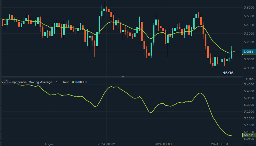 |
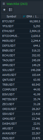 |